Renko charts were invented by Japanese traders hundreds of years ago, They are named after renga, a Japanese word for“brick.” Renko charts represent price changes but ignore time and volume.
How different are Renko from bar or candlestick charts?
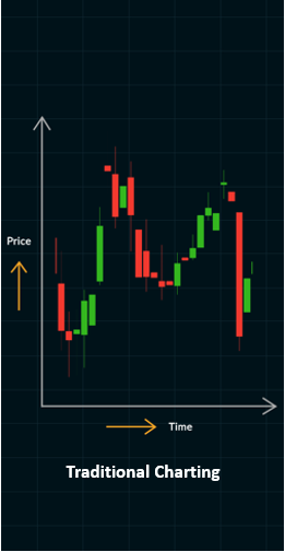
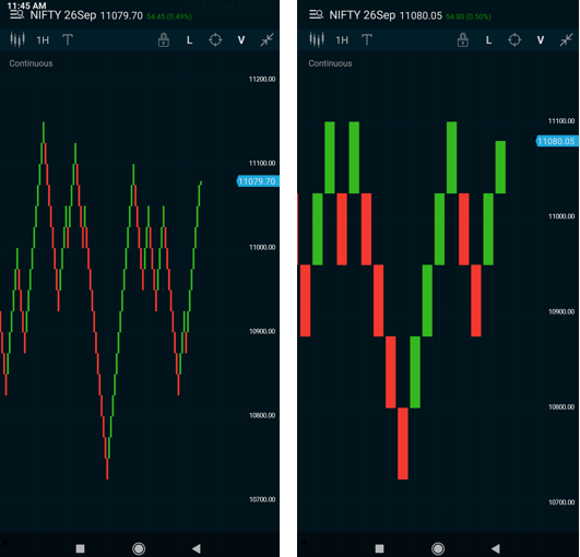
Bar or candlestick charts have two dimensions: price and time. Price is plotted on the y-axis. And time on the x-axis. Charts move when each unit of time passes by, and the price is plotted with respect to the time it represents as you can see in Fig. 1.
Renko charts ignore time. They represent a change in price, when the change that happens is large enough to be significant for the user. The chart user can choose to define the size of this price move that she considers significant to be represented.
How are they useful?
- They are visually attractive, making it easy to filter noise and isolate trends.
- They show symmetry and are effective in determining major trends and support & resistance areas.
- Renko charts are also efficient in signaling trend-reversal patterns.
- A trader tends to stay in a trade longer than other trend-following techniques.
Can they make the decision process easier for a trader?
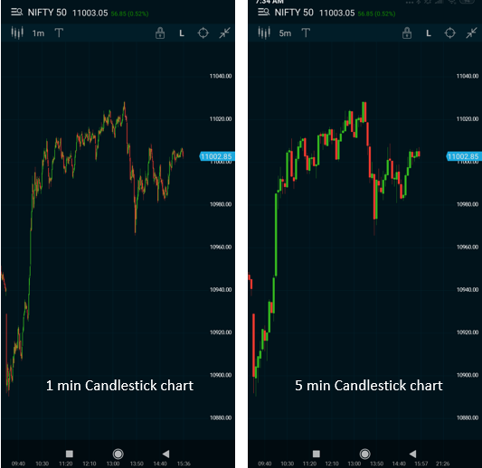
As you can see in the images below, a typical 1-minute candlestick chart of Nifty in Fig 2. has 315 bars on a single day. A 5-minute chart in Fig 3. has 63 bars. A similar Renko chart, let’s say for a 10 point move(I will discuss this in detail), can be represented in 15 to 20 Renko boxes on a typical day.
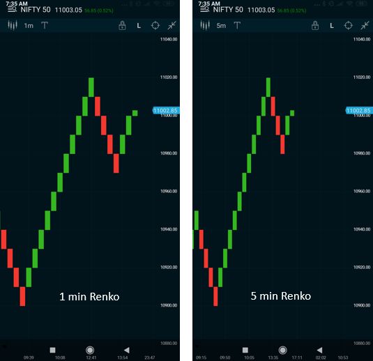
I have also shown two Renko charts for 1 minute and 5 minute timeframes in Fig 4 & 5, where the brick size is defined as 10 points. Both the charts have almost identical boxes, with minor differences, showing us that time has minimal role on Renko charts.
The fewer boxes reduce the number of variables you need to consider for your trading decisions during the trading day.
Renko Bricks & Trends
Renko charts are composed of red or green“bricks” or“boxes” that move in the direction of the trend. Usually, a trend starts displaying a reversal box(red to green or green to red) and continues for one or more bricks in the same direction. Once a renko brick is formed, it is not going to change its direction until the next one forms.
If you look at conventional charts such as bar charts or candlestick charts during similar time periods, you may find them generating various trend changes. But a renko chart will remain in the same trend until a reversal box appears.

Renko Box Formation
If you are looking at a daily Renko chart of the Nifty futures with a brick size of 100 points, and if on the following day the Nifty closes 220 points up, you will see two bricks (each brick for 100 points) displayed in the up (green) direction. Similarly in a downtrend, if the Nifty futures closes down 120 points on the following day, a single 100 point red brick is displayed to the downside.
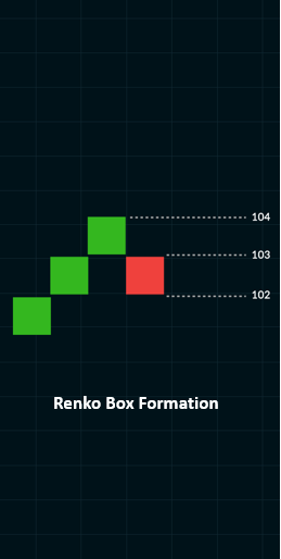
Renko boxes are never drawn next to each other. They are always drawn at 45-degree angles to the prior box as shown in Fig 6.. The size of the box will never change, nor will it be removed once it is created.
Renko Box Size
The size of the box determines the generation of a new trend. Smaller box sizes would mean more boxes and more whipsaws. Bigger box sizes would mean slower price action and more delayed entries. You can see this in Figs 7 and 8, the hourly chart for Nifty futures for the last 1 month, using brick sizes of 25 and 75 respectively.
Setting up the box size in Renko charts is more an art than a science. Various studies have been done to determine optimal box sizes, but most are specific to individual securities and their volatility range.
As a thumb rule, a minimum size of 1% can be applied to daily charts. On intraday charts, some traders prefer to use a fixed smaller box size based on the volatility. A few studies have been done to see if average true range(ATR) may help in determining box size, while other studies suggest using a fraction of the opening range for intraday trading. The box size also can be varied depending on the time frame.
You need to experiment with various box sizes and find one that fits your trading time frame and indicators. For example, if you are trading a stock valued between Rs. 500 and Rs. 1000 and using a five-minute chart, you may opt to use a box size of Rs. 5. For higher-priced stocks you may want to use a box size between Rs. 10 and Rs. 20.
From experience, I have found that intraday Renko charts are more efficient than the end-of-day version. This is because it could take days or even weeks for the next box to develop in an end-of-day Renko chart.
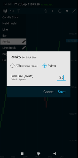
You can set up the brick sizes on the Market Pulse app as shown below in Fig 9 based on fixed brick sizes or the ATR and experiment with your charts.
Going forward, we will look at a more detailed study on trading patterns, using indicators and some rules and caveats one must understand for Renko trading mastery.
Good luck Renkoing!